Pygg
Pygg was a design task for an interview at a fintech company in Europe in late 2019. I made it in less than 4 days so you’ll see that I cut some corners to finish in the time frame available.
The task brief was this:
“Joanne needs to give some pocket-money to her little daughter Jessie (8yrs). She is pretty tech-savvy and so her little one. She wishes there was an easy way that could help her give pocket money to her daughter, track how Jessie spends it, and educate her on how to use it properly. Design a solution that helps Joanne give pocket money to Jessie, track her expenses, and educate her on how to use money properly.”
About the name
Pygg is an orange-colored clay commonly used during the Middle Ages as a cheap material for pots to store money, called pygg pots or pygg jars. There is a dispute as to whether "pygg" was simply a dialectal variant of "pig." By the 18th century, the term "pig jar" had evolved to "pig bank" or “Piggy bank” now. Source.
Competitive analysis
Applications that only track your expenses and can intergrate with your bank accounts:
Applications that are a full-featured digital banks in Europe:

User Research
At first, I was going to make this app as a tracker only. But after some research and talking to some friends in Amsterdam, I found that almost nobody uses cash in Amsterdam and even public transport doesn’t accept cash anymore. Also, no parent would give their young children a huge amount of cash if they’re going on a school trip or something. So I diverted the idea to be a digital bank app.
Use-case scenario
To put myself in the user’s shoes and ignite my empathy, I like to write a story to identify the optimal flow for my targeted persona. And the more I write, the more ideas start flowing into my head.
Here’s what I wrote for Joanne and Jessie: Use case scenario document.
Identifying the problems
So as we’ve seen in the use case scenario, the problems are:
- Giving Jessie a cashless way to pay for her expenses
- Transferring money from Joanne to Jessie
- Giving a way for Joanne to track Jessie’s expenses
- Giving a way for Joanne to teach Jessie how to make better financial decisions
I chose to cover points 2, 3, and 4 more thoroughly in the wireframes because they are interesting to me and I’d love to use something similar in the future with my family.
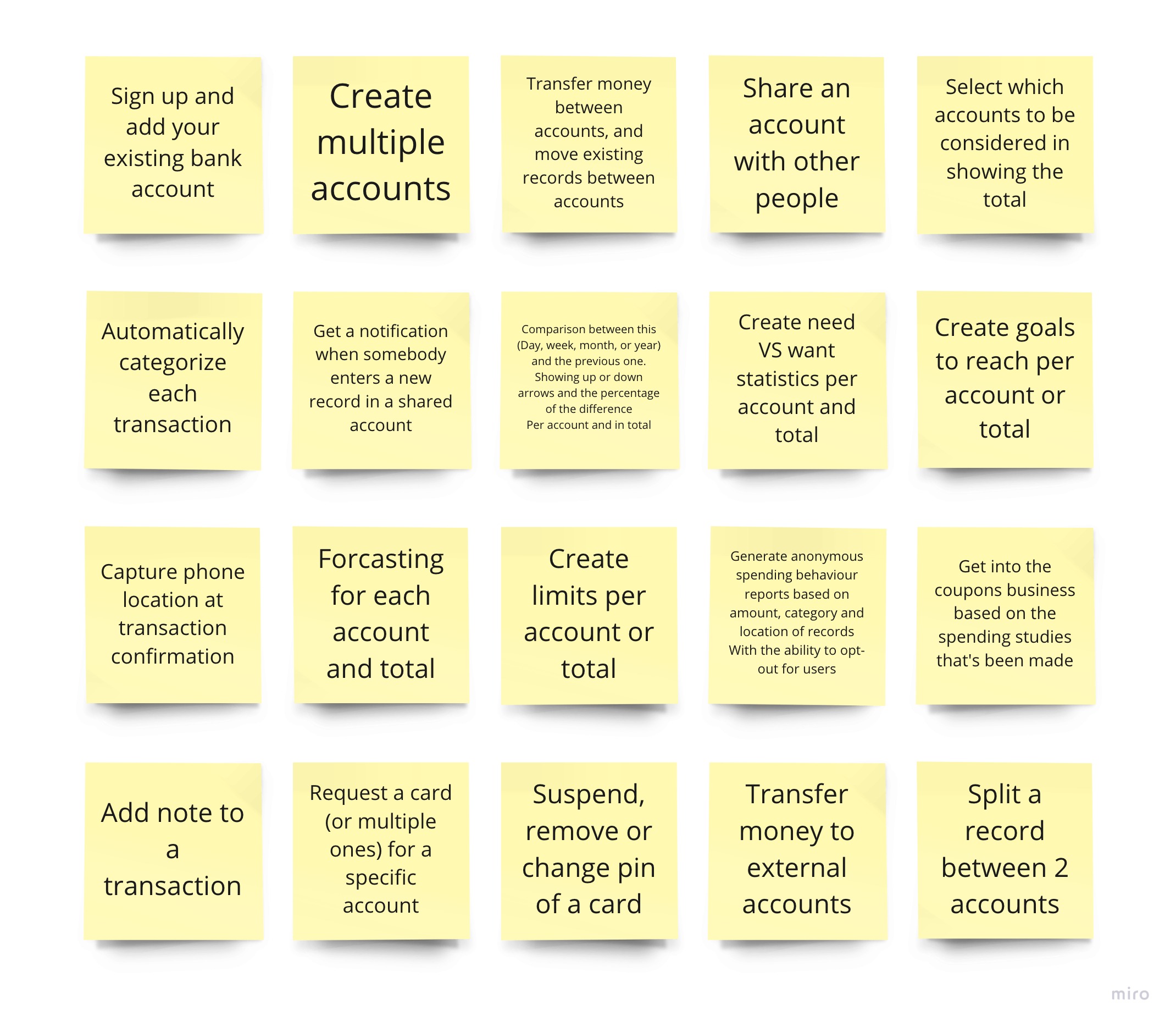
Ideation
After getting empathized and inspired, it’s time to write ideas on paper. In this exercise, I wrote a single idea per sticky note.
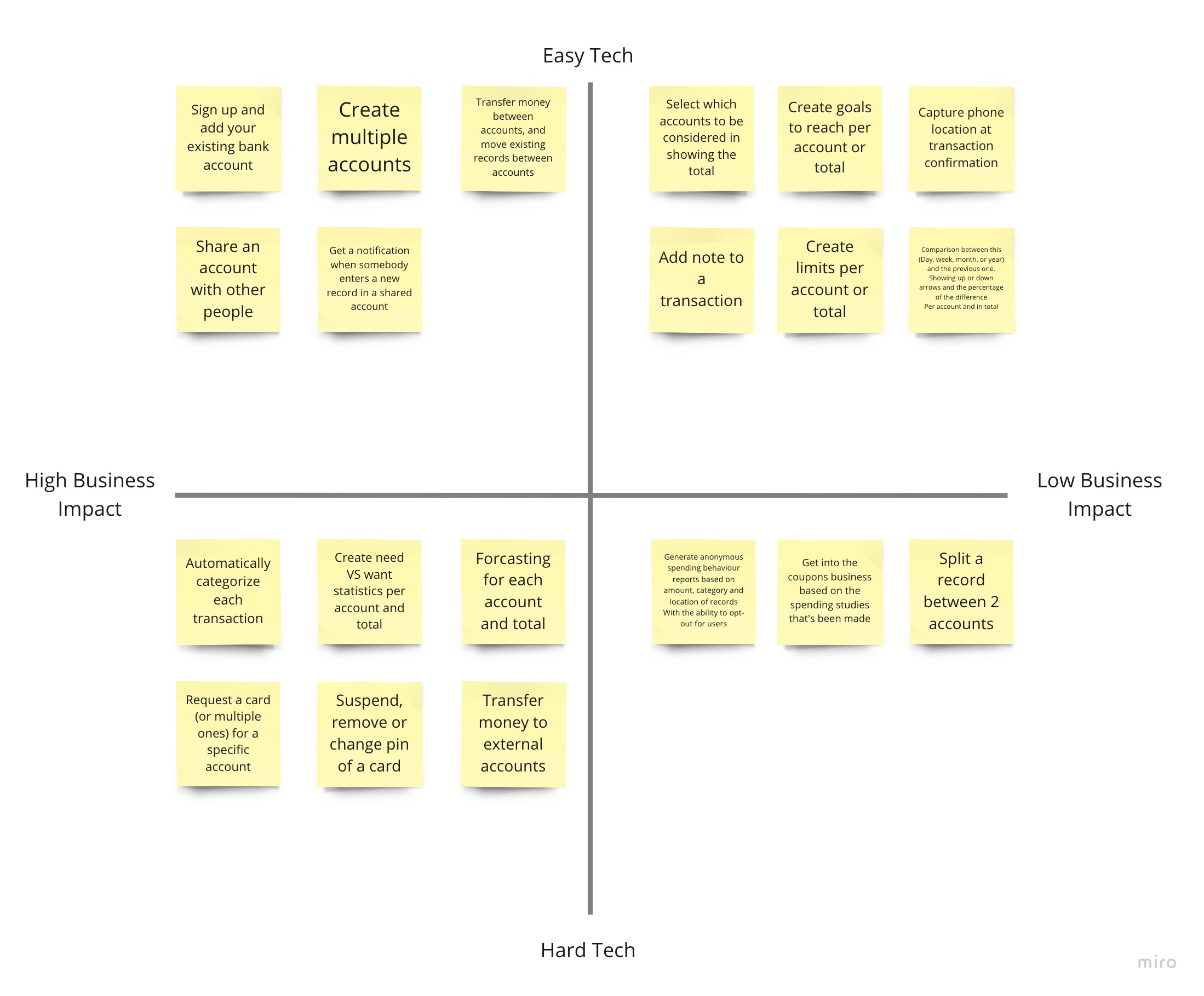
Card sorting and prioritization
At this step, I took the ideas cards and sorted them on this graph based on their technical feasibility and their business impact. Based on the assumption that this is a new application. Because some ideas would have a bigger impact if it’s an already well-established company. After laying them out my priority would be in a diagonal direction (from top left to bottom right) and assuming if the app has only the cards in the top left section, it would be an MVP.
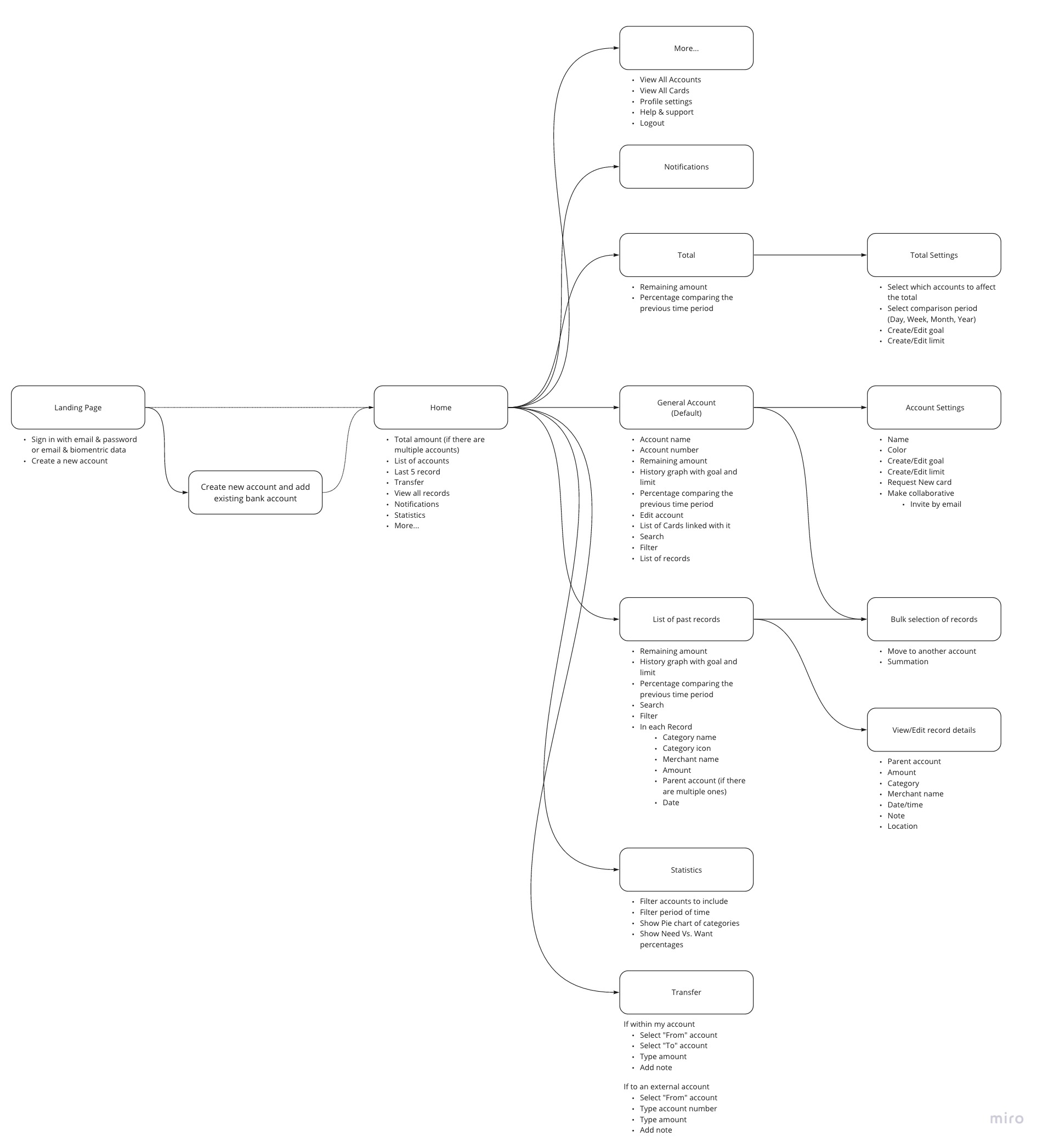
User-flow diagram and information architecture
At this step, I’ve listed the screens in pills, the connections between them, and the content of each screen under it. Please read this diagram thoroughly as many features are not listed in the wireframes due to time limitations.
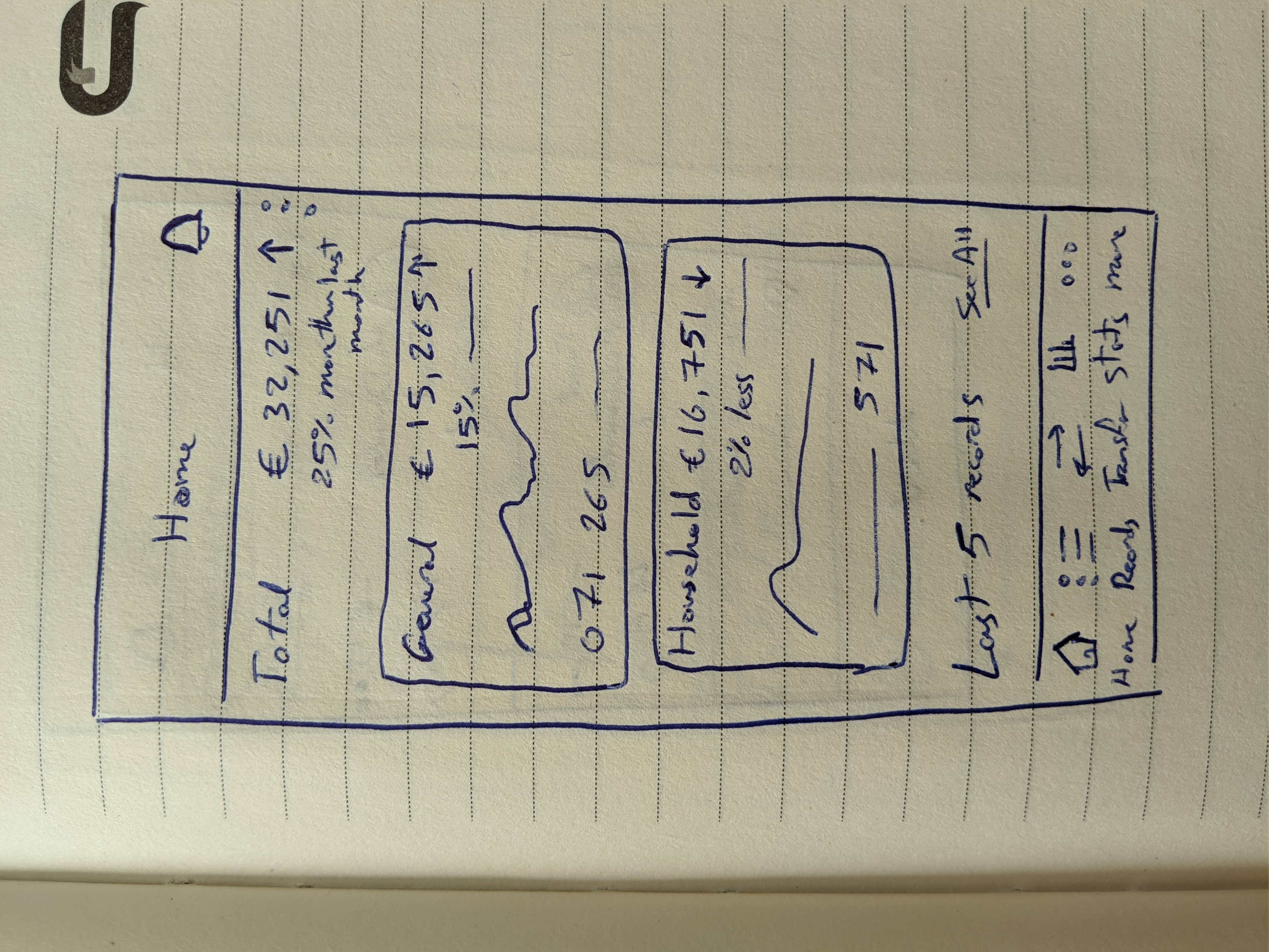
Also while working on the information architecture I was hand drawing some sketches to test those ideas and iterate on the content. Here’s an example:
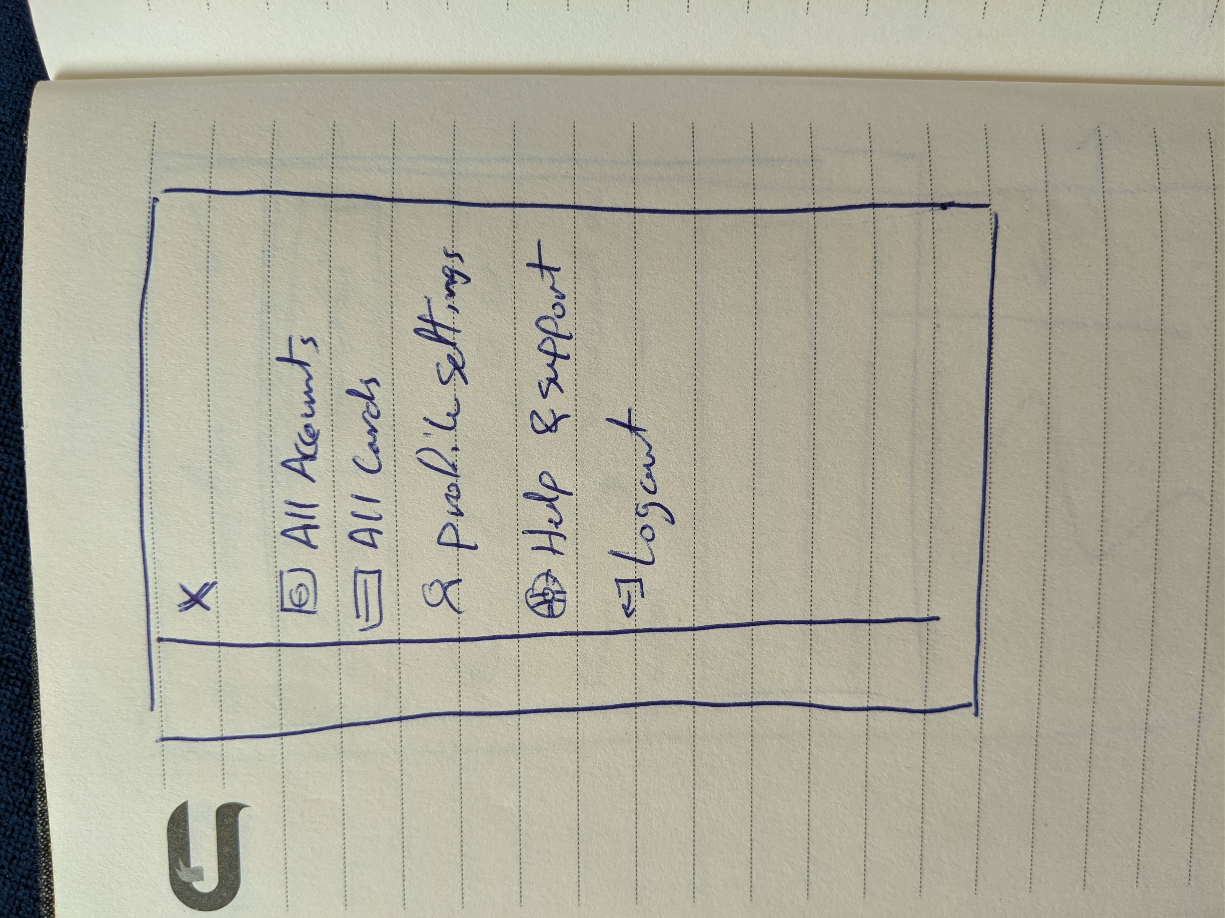
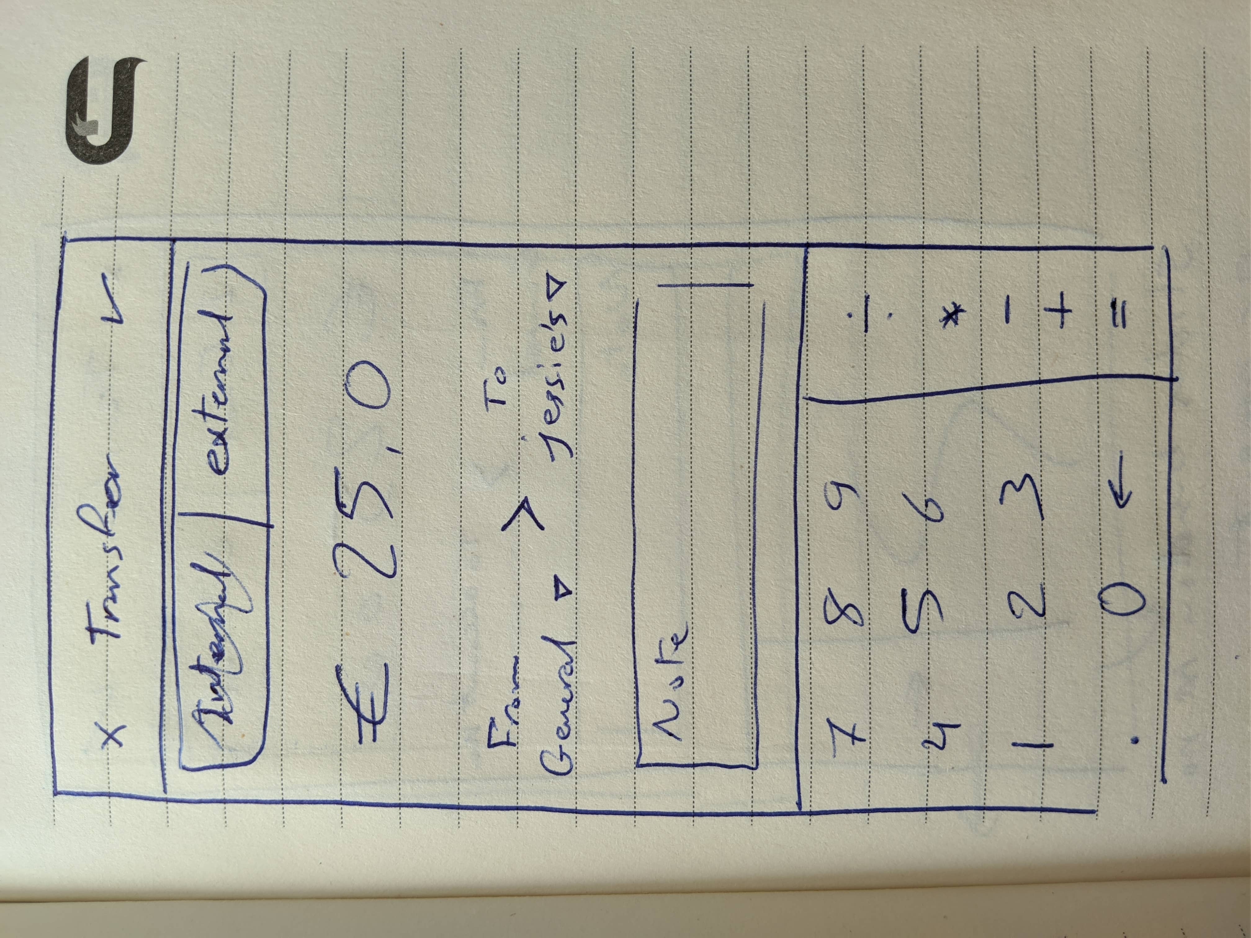
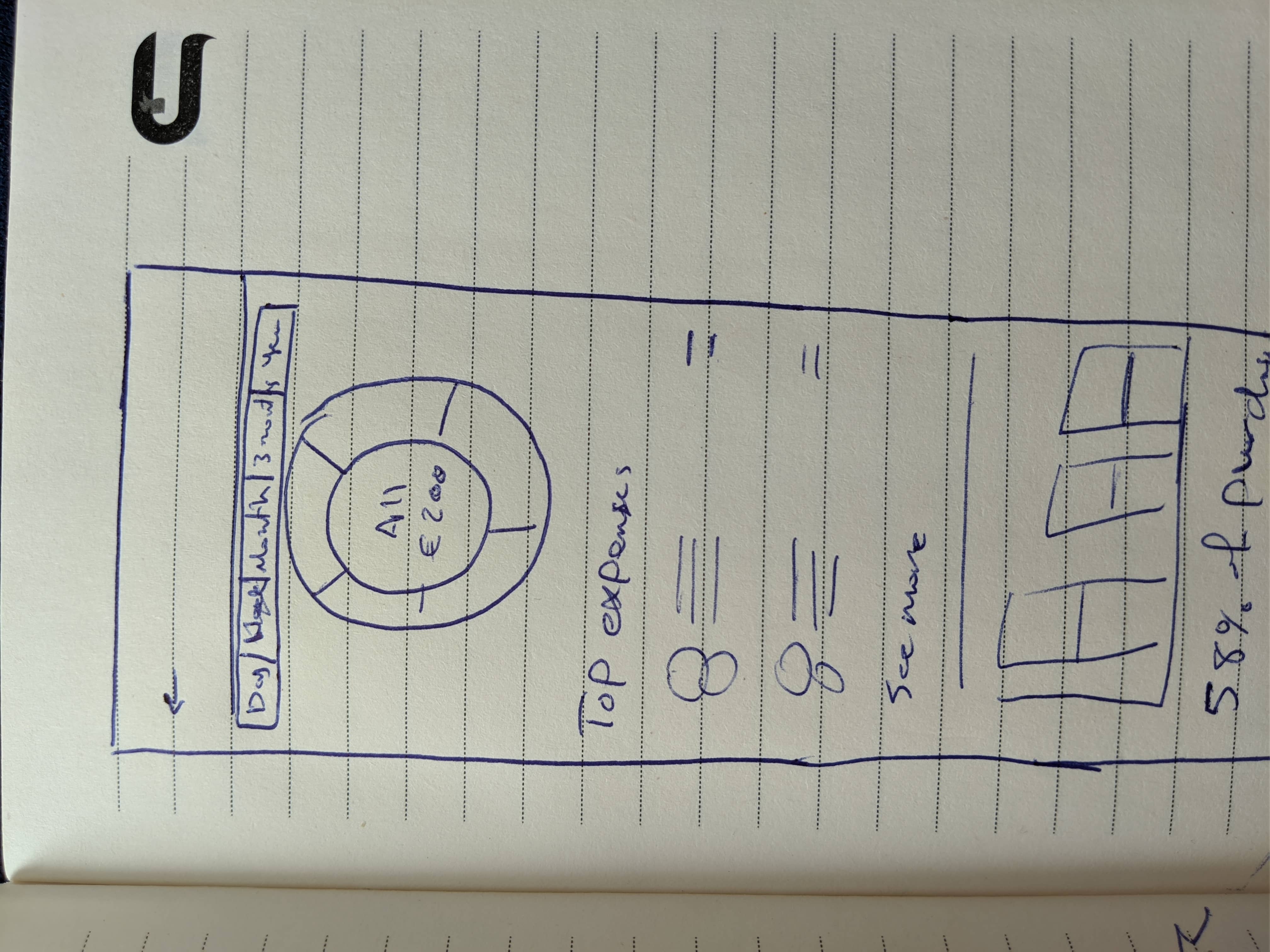
Interactive wireframes
I made high fidelity wireframes using iOS native components for time efficiency. I assumed that Joanne already created an account for Jessie, shared it with her, and got a debit card just for her account. The scenario I prototyped is:
- Joanne home page after creating Jessie’s account
- Joanne transfers money to Jessie’s account
- Joanne home page after the transfer
- Joanne home page after Jessie started using her card
- Joanne checking a notification after Jessie made a purchase
- Joanne checking the latest record from the notifications
- Joanne checking Jessie’s account and purchases
- Jessie home page while using the card
- Jessie stats page to analyze her financial behavior
Business Model
I came up with this model based on the competitive analysis I did before.
Free plan:
- Link your existing bank accounts
- Create up to 3 accounts
- Unlimited transfers between your accounts
- Free external transfers up to €500 a month
- Request 1 card per account for a 1-time fee per card
Premium plan: (€9.99/month)
- Create unlimited accounts
- Create unlimited shared accounts
- Add goals and limits to your accounts
- Free external transfers up to €5000 a month
- Request multiple cards per account with discounted fees
- Free global ATM withdrawal up to €5000 a month
How success looks like
- High user satisfaction, by measuring NPS score surveys.
- High engagement, by measuring frequency and depth of interaction (number of transfers, number of times checking stats and playing with filters, etc...)
- High adoption, by measuring how many users use new or advanced features (like account goals and limits, etc...)
- High retention rate. My goal would be to get 80% of the users to open the app at least once a month.
- High task success and low error rate.
- High conversion rate for the premium plans. Can be boosted by customers’ referrals with discounts.
Closure
Unfortunately, I didn’t pass the interview, but I like what I did here. Maybe if I had a little bit more time I would have improved the visual design part, but otherwise, I think it’s good.
I hope you’ve enjoyed reading this, feel free to reach out to me at any time through the below links and let me know what do you think of this outcome, do you like it or not?
Back to projects