The Purpl Card
- Role
-
- Card design
- Concept to print files
- Timeline
-
- Jul 2024 to Jul 2026
- Worked with
-
- Cofounders
- Marketing
- Our partner bank
- Visa
- Tools
-
- Figma
- Illustrator (CMYK files)
The first physical product
I remember very well when we got into a call with the CEO and he informed me that we were going to start working on the Purpl card. I was very excited because this wouldn’t just be the first physical card I’d ever designed, it was the first physical product I’d ever designed. Through my whole career I’d been designing digital products for more than a decade, and this was the first opportunity for me to design something that people would hold in their hands and use on a daily basis, and so, it had to be epic!
I wanted to rush to the drawing board and start sketching, but I also understand that design is all about delivering the best experience within the system’s rules and limits, so I had to understand those rules first to know the playing field.
I got the Visa card design guidelines from our partner bank and carefully studied them, looking for every detail I could remove to keep the card design minimal and elegant. Once that was done, I started sketching some ideas and I decided that the card design should represent the app’s value propositions. It couldn’t be an independent entity away from the app, no, it had to feel like an extension of it with strong continuity.
The two themes I landed on were:
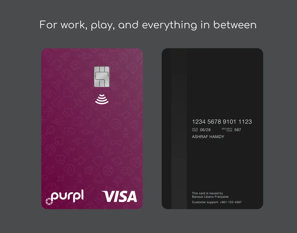
1. For work, play, and everything in between
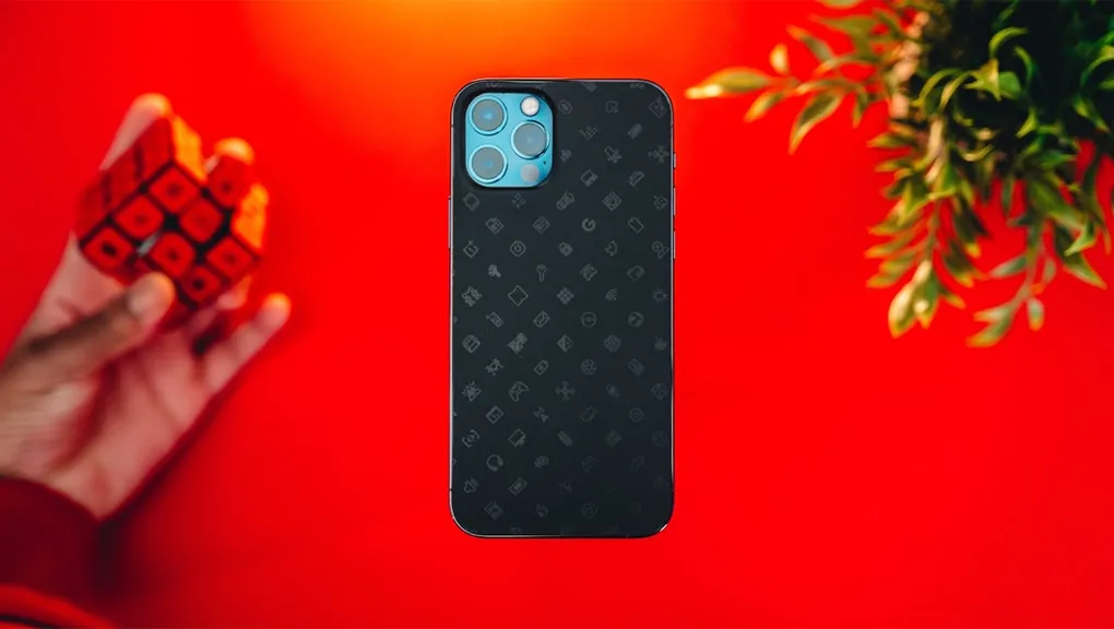
This theme promotes how we intend the Purpl app to be used: you receive your income on it, whether it’s from abroad or locally, and pay for your daily expenses and your entertainment subscriptions (streaming, gaming platforms, etc.). Work hard, play hard kind of vibe. And the design of the card was inspired by a collaboration made between MKBHD (a tech YouTuber) and dbrand (a device skins and cases company), which featured a lot of small glossy icons on a matte background of the same color. So I designed an array of rounded line icons with some subtle gradients to explore the idea.
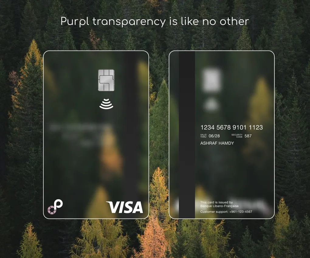
2. Purpl transparency is like no other
This idea was inspired by how vague card fees often were in Lebanon, both transaction and monthly fees, so this would extend our value proposition of being fully transparent to the card activity as well. It would act as a promise to our customers that we’ll always be transparent and never copy what the competitors do, in a market that already had one of the lowest levels of trust in financial institutions in the world after the crisis that happened in 2019.
Transparent, but minimal
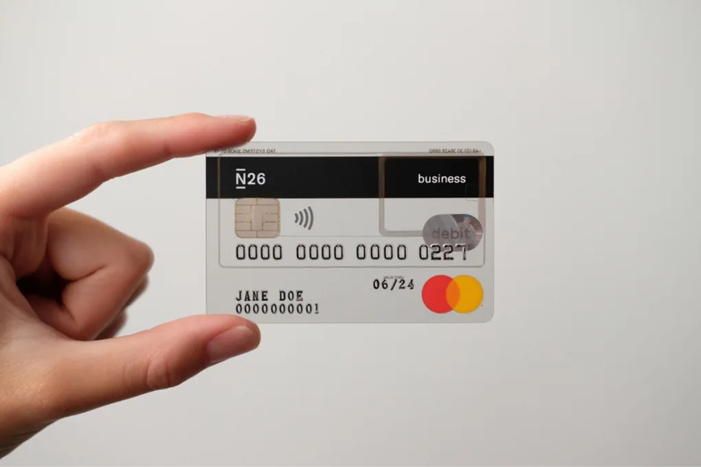
The second concept was much more striking. I instantly connected with it and was so excited to make it a reality. I did some research to see if any other bank or digital service had done it already, and how it turned out. And I found that N26 (a digital bank in Germany) had done a fully transparent card before, but it was too busy, which defeats the whole purpose of the concept I wanted to do. I wanted to make it so minimal that it included only the Purpl logo, Visa logo, NFC indicator, chip, and magnetic strip. Basically, any non-essential content or logo had to go for the design concept to work out.
I wanted to remove even the card info, since it was accessible through the app, and Visa’s guidelines allowed leaving it off. But the head of marketing and co-founders didn’t agree and thought it’d be too much, especially since the Lebanese market is not that mature in terms of card usage, and internet access can be challenging in some areas, which meant we couldn’t guarantee that users would always have access to their card info. So I accepted that trade-off, but everything else, I pushed back quite hard on. For example, the partner bank team asked to add the Visa Dove hologram, but I went back to the guidelines and showed them that Visa accepts removing the hologram if we use the “Premium Visa Brand Mark” instead, which is a metallic version of the Visa logo with security features built in.
Working with the bank
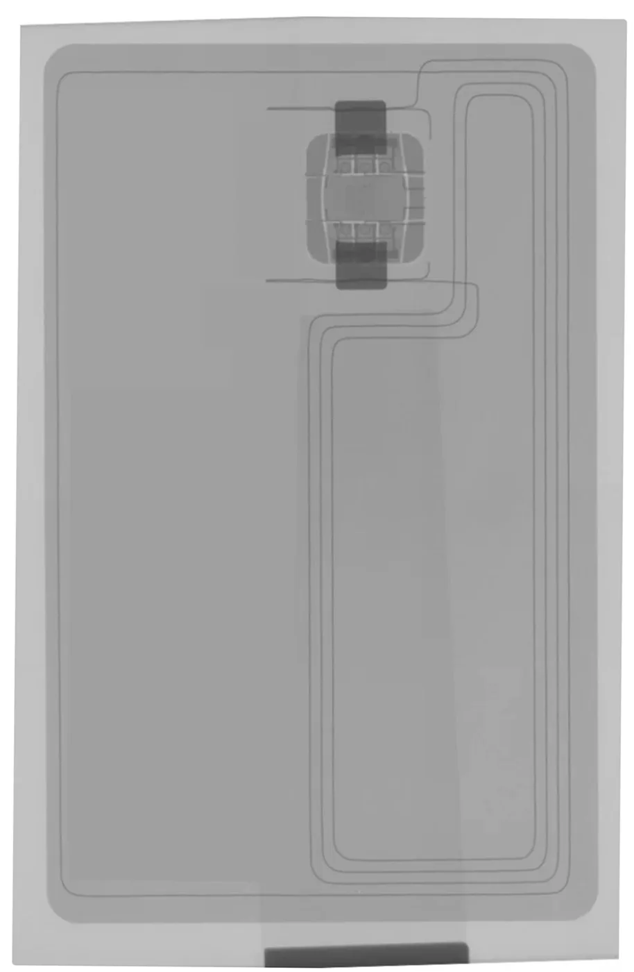
We worked closely with the partner bank team, making different iterations to make this concept a reality. We asked them to show us a card plastic material that could look like frosted glass, so that the card front and back content wouldn’t fully overlap, and would have some contrast to read the card info printed on the back. They also highlighted that the NFC antenna runs through almost half of the card, which I later added to the card designs to make them as true as possible to the expected result in reality. Then the partner bank marketing team wanted to add the bank logo, but we kept pushing back to keep it only as text.
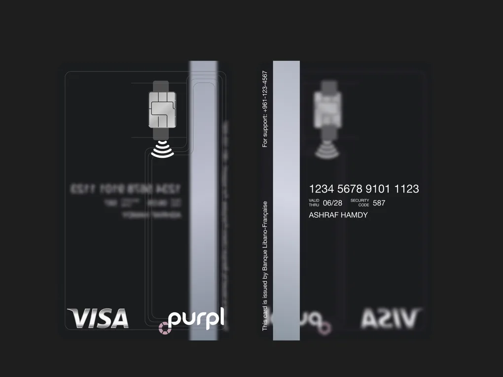
Once we settled on a final design, we asked several times for a sample print before submitting it to Visa for approval, since each submission costs money. But the partner bank was using a third-party printing facility, which made the whole process even more complicated. And we couldn’t get any samples before printing the first batch.
The first batch
When the first batch arrived and our team members got their cards, we realized that the card plastic material didn’t look as good as we expected it to be. At that time, the cards weren’t live yet for other reasons, so we had a chance to go back to the drawing board and consider whether we wanted to try another plastic material for the next batch or submit an entirely different card design.
By then, the co-founders had already decided on a brand refresh, since the company was growing while the initial branding had some shortcomings. The primary color, for example, had some limitations: its lighter shades were more pink than purple or burgundy, so they went ahead with a brand refresh (more of a refinement), which meant the card design had to be updated anyway, either with just the new logo or a completely new design.
Back to the drawing board
We decided to avoid repeating the same mistake of depending totally on the card material to deliver our design, since we didn’t have full control over the card printing process, and I went back to the drawing board, broken-hearted that the idea I genuinely believed in didn’t work out as I intended it to be. It was hard to come up with some good ideas while the transparency concept kept hovering in my head. In a way, I couldn’t let it go, but I went ahead and did some sketches and iterations anyway.
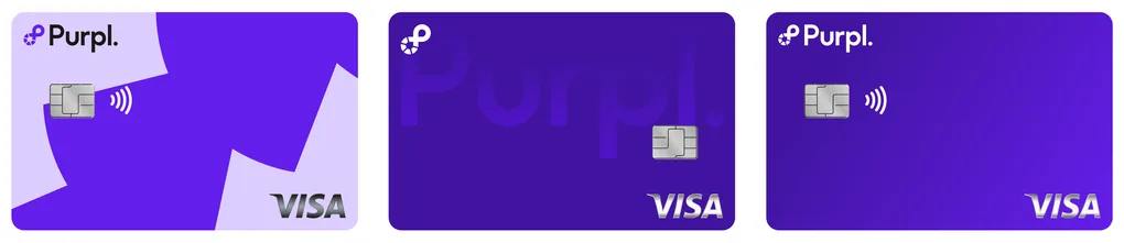
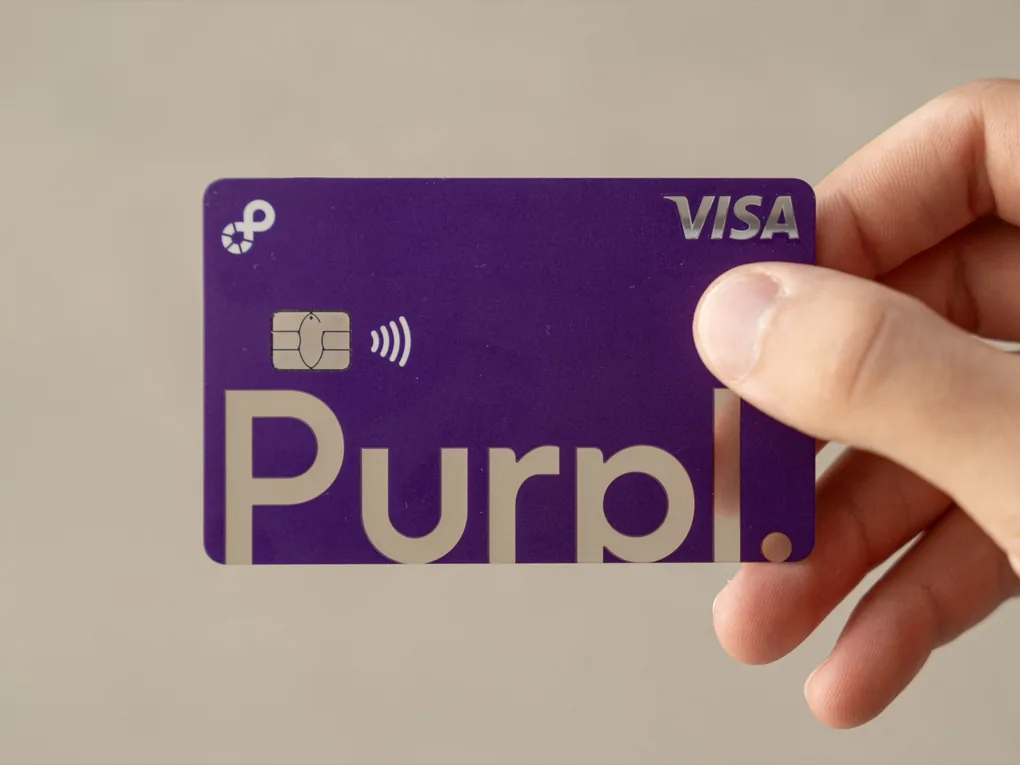
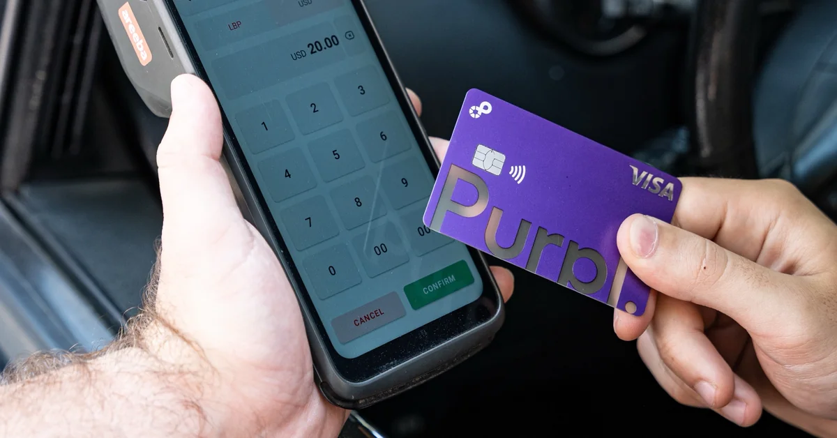
Then, after a few more rounds, I landed on the perfect middle ground between covering most of the card plastic and, at the same time, keeping the transparency concept alive. I made a design where the bottom has a transparent cutout resembling the Purpl text logo. This conceptually still preserves the idea that Purpl is the most transparent service in the cards realm, while everything around it is not. This design also perfectly avoids the NFC antenna lines, so the transparent part is uninterrupted.
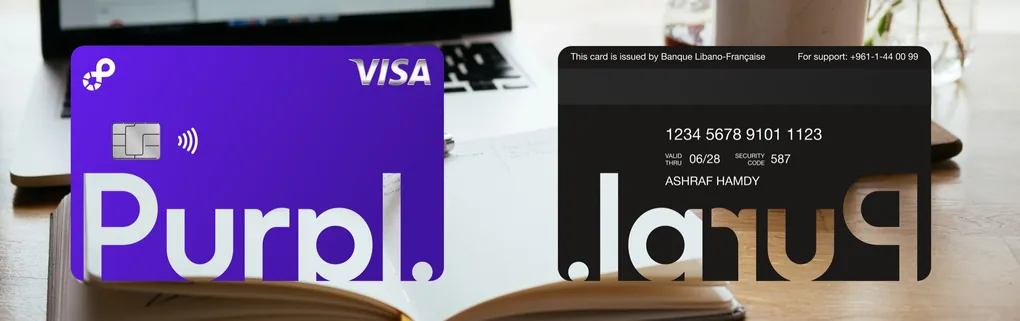
When I presented this new concept to the rest of the team, they were all impressed by it and got hooked on it immediately. The CEO even said “This is the direction I was thinking about”. So they all felt that this design represented them and belonged to them, which is such a rare moment in the design world: that kind of consensus.
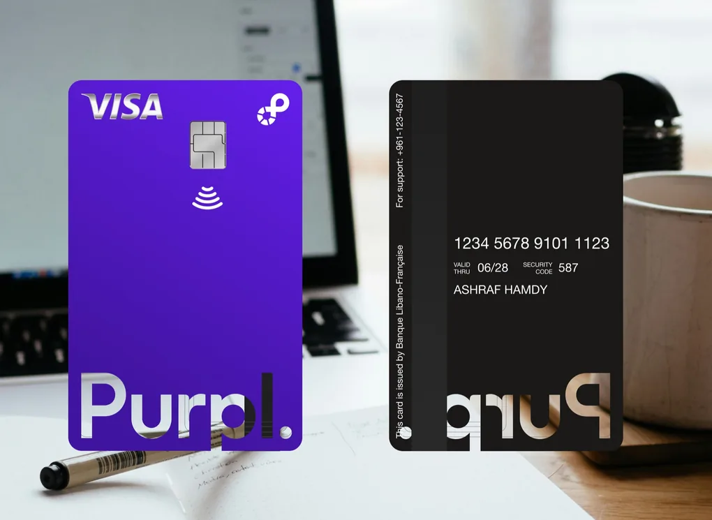
The only open question was the orientation. Our COO preferred a vertical card, so I tried both, and the horizontal one worked better in every way. On the vertical card, the NFC antenna and the magnetic strip ran across the cutout, while the horizontal one kept it clear. And Apple Pay and Google Pay show cards horizontally too.
A leap of faith
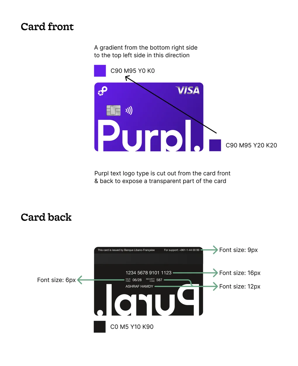
The story doesn’t end here, though. There was still one more challenge. Now I needed to deliver this card design, which included a subtle gradient, in a CMYK format (I’d never really worked with it before, and I’d never done any print design, not with such high stakes for sure). And remember, we still didn’t have access to test cards! We just did our best and took a leap of faith with the next batch.
I hopped on a call with our marketing graphic designer to try different iterations on how we could make the CMYK version look as close as possible to the intended RGB design, and reviewed it with AI tools to double-check everything, since visually the CMYK looks significantly different on a screen, and that’s expected, but we couldn’t afford any mistakes again.
Closure
Luckily, this time the printed card came out well. It’s not perfect, but from the team’s feedback and the photoshoot they did for the card, it’s very close to what we intended, and it was very rewarding to see it out in the wild after going through this journey. It’s one of the projects that sits close to my heart because of how it pushed me out of my comfort zone, and how I held on to the transparency concept despite the speed bumps we faced, and delivered something I’m proud of at the end.