
Casemasters
Casemasters is a social network for dentists. A place for them to share their medical cases with images and videos to get feedback or just show off their skills. I worked on this project in 2018.
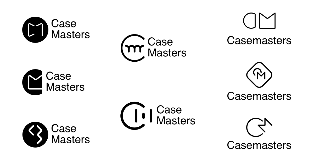
The logo
I did the logo of the app and focused on the mobile app user experience. While another designer colleague of mine was focusing more on the web app and the front-end part.
The name was already decided before I joined the company, and I was neutral about it so I didn’t try to change it, but they didn’t have a proper logo so I stepped in.


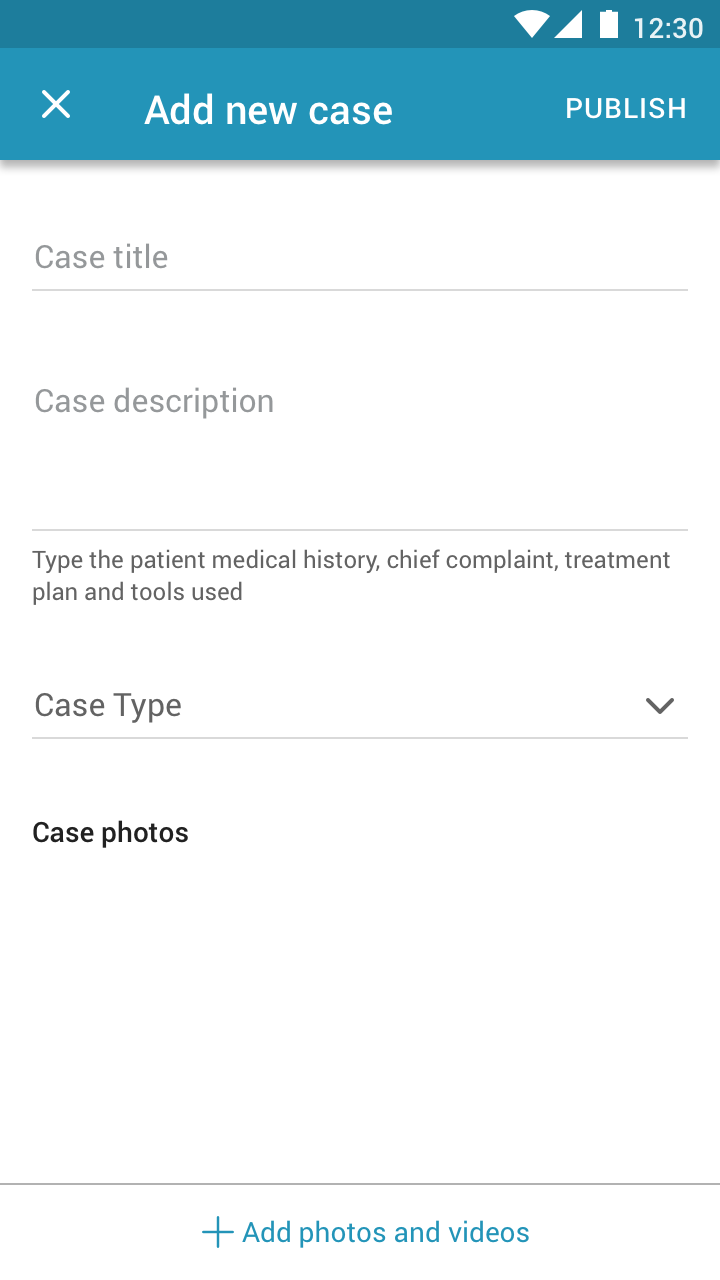
The “Add New Case” experience
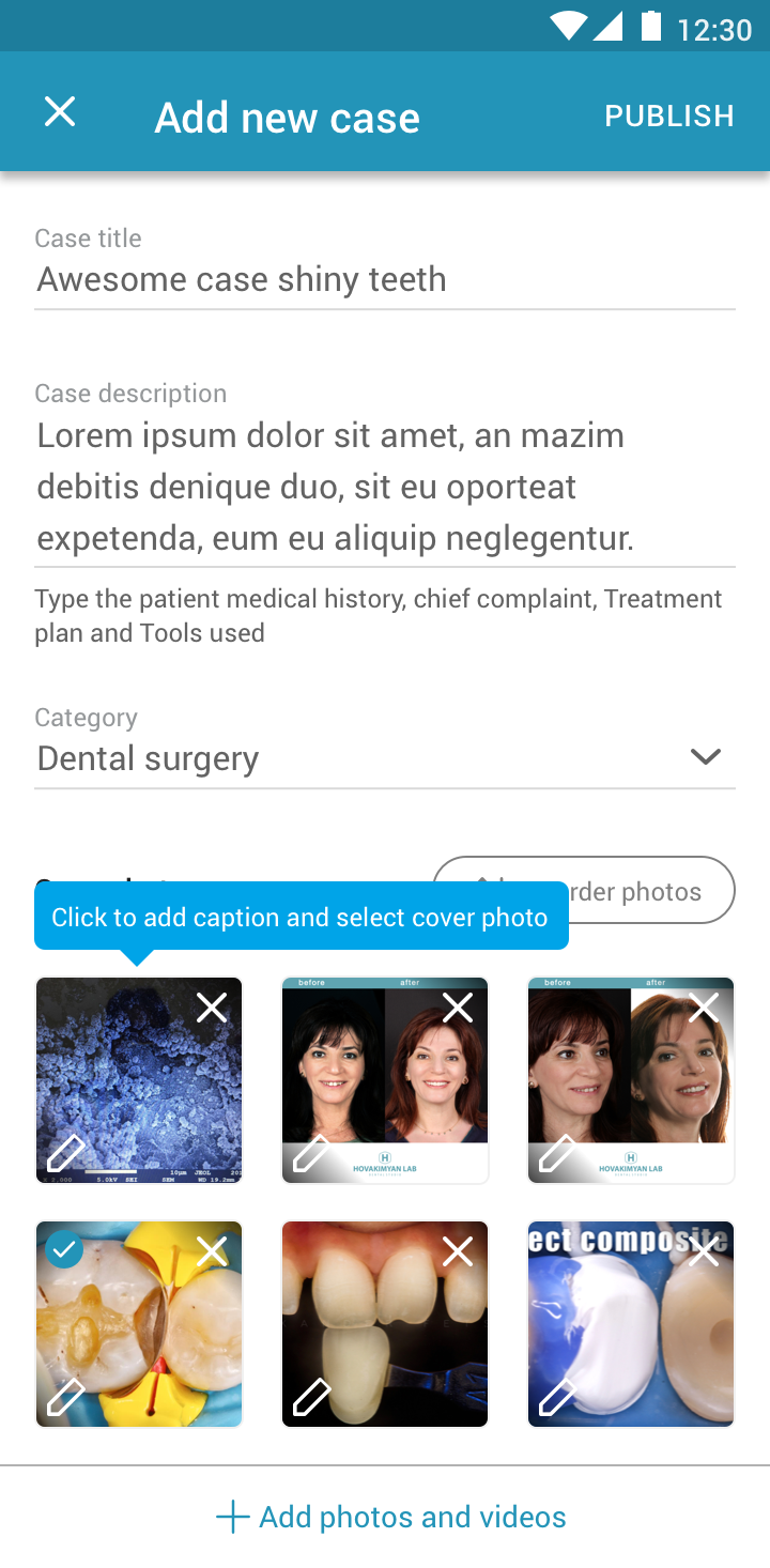
Adding a new case is the most important part of the app because everything else depends on the existence of cases. The problem is that it had quite a number of features which created a dilemma of choice. Break down those features into steps and increase the number of pages the user would go through to post a case? Or find a way to add them in a single page and post a case in a single step?
The features were:
- Adding the case metadata (title, description, category)
- Adding the case photos and videos (and removing them too)
- Adding captions to those photos and videos
- Selecting a cover image
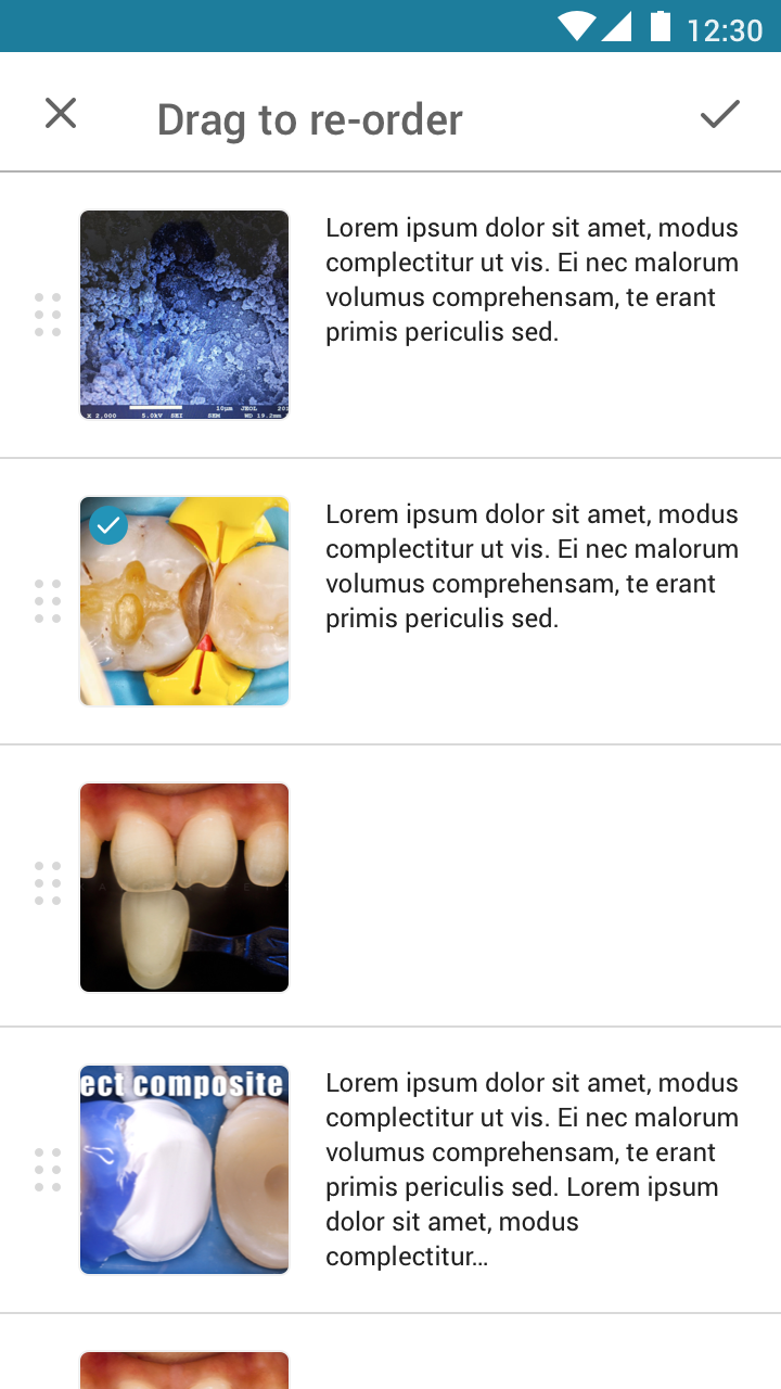
- Reordering the photos and videos
Also, put in mind that the number of images and videos in many cases can be more than 20 images and videos, so listing the media vertically in large previews with the captions, dragging, and select cover features would be too much inside the boundaries of mobile screens. We did that on the desktop because we had space and it was comfortable for the dentists, but on mobile it was unpleasant.
Because based on our interviews and usability tests, the dentists usually review the case multiple times before publishing. They would add new photos, remove some, edit captions, reorder them, and do it all over again. That’s why we wanted to make this review process as easy as possible to help the dentists upload high-quality cases which will gain high-quality interactions.
The first iteration was to try to divide and conquer, break it down into 3 steps:
- Add the case metadata and hit select photos & videos
- After selecting the media, they are brought to the second step, which is to type the images captions, select the cover, and also add or remove any media
- To reorder the media, while also showing the full captions to make sure that the media and captions are in the right order then publish
When we ran a usability test with a group of dentists, they liked it but it wasn’t ideal because they were going back and forth between steps 2 & 3 multiple times due to 2 problems. They add a huge number of photos/videos and they need to see the image or video in full view while writing the caption because the visual difference between 1 step and the other is usually very little, and they need to be able to differentiate between them to write the correct caption.
That’s why the team was against the “steps mode” and was in favor of having a single page that has all these features, but each one opens in another page and comes back to the main publishing one. The less streamlined experience gave the users the feeling of being just 1 step away from publishing their case, which they preferred.
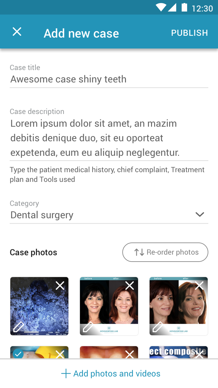
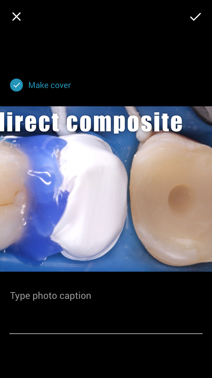
Due to this way of interaction, the discoverability of adding the captions and selecting the cover is hurt badly, so we added a small tooltip to the first time or low-frequency uploaders.
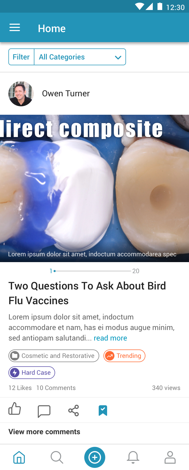
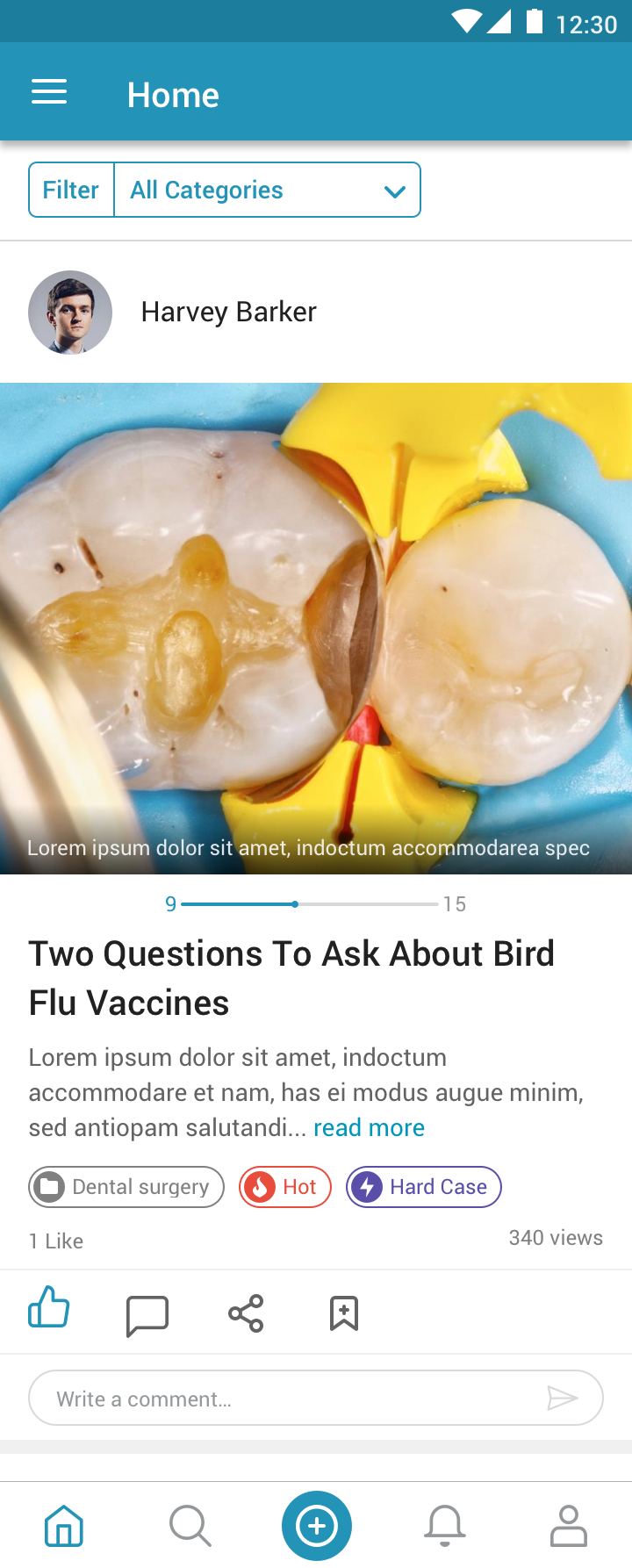
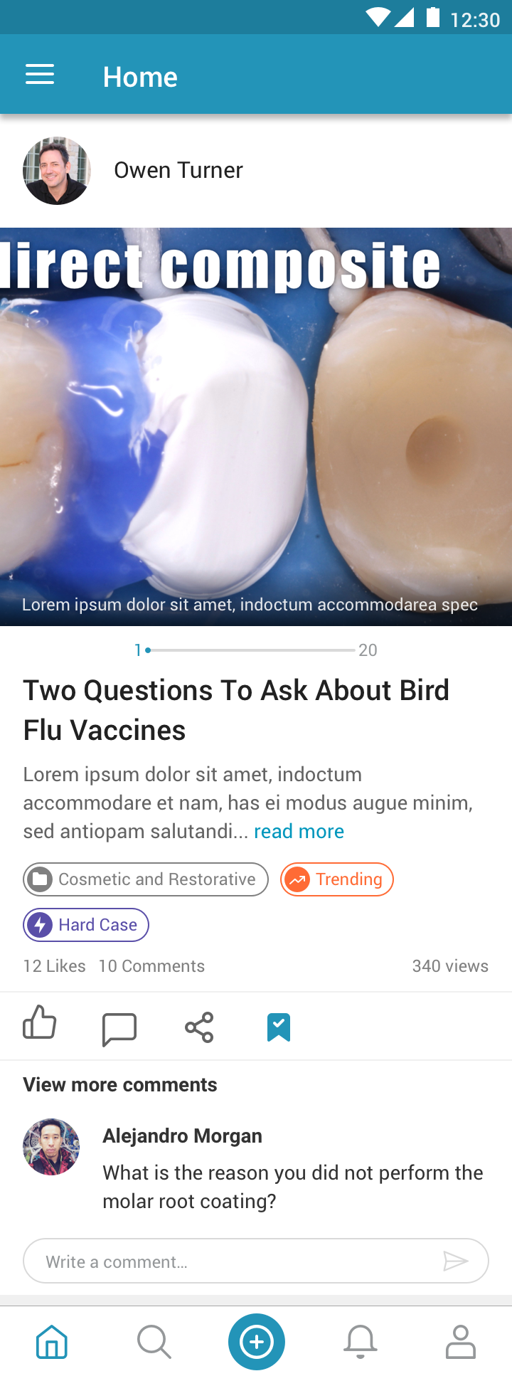
Timeline carousel
Another challenge we faced due to the huge number of media in the case was the case carousel at the home timeline preview. We wanted to let the user see all the images and videos in a carousel-style from the timeline to easily and quickly interact with the case, while also showing the total number of photos & videos so the user knows what he’s swiping into.
So we’ve made this slider looking element, that shows the current image number I’m at on the left, the total on the right, and the dot moves a step with each swipe. This way we support showing the status of a carousel that has from 2 photos up to a hundred, or even more, the step is just going to get shorted when the total increases. It also looked consistent across all the cases which is a plus.
Content discoverability and engagement
Casemasters wasn’t an app that dentists would use every day. The average user would open the app a couple of times a month, maximum once or twice a week. So we wanted to surface up the high-quality cases to increase engagement and retention. So we decided to add some tags beside the case category to show its trending status. There were 3 tags (Fresh, Trending, Hot) that were inspired by 9gag (funny, right?) and it’s calculated by how many views the case got over a certain period of time.

Also, on trending and hot cases we showed a question at the end of the case “Do you think this case is hard?” to collect dentists’ opinions and after enough votes the case would receive a “Hard Case” tag to grab the dentists attention because they always love to see the hard cases.
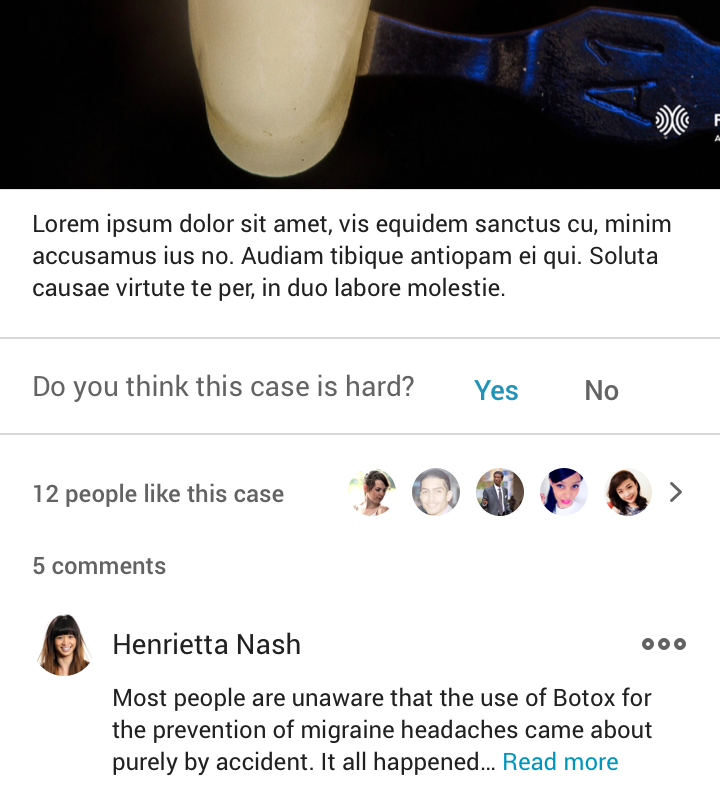
All of these tags would also help the users in filtering their timeline because clicking on any filter would show only the cases with this filter. And that would help the occasional dentists to view the hot cases or hard cases only and follow-up with their community.
Closure
Unfortunately, the project got discontinued at the beginning of 2019, less than a year after I left the company, due to lack of monetization.
I enjoyed working with Casemaster’s team so much, I learned a lot from them and also from the dentists' community.
I hope you’ve enjoyed reading this case study, feel free to reach out to me at any time through the below links.
Back to projects